Project
INtroduction
Summit County, Colorado, offers free public transit service to access ski resorts, lodging, retail areas, and medical centers. To use the service, visitors have to download the bus schedule and route map on the Summit County government website. However, some routes use the same stops on similar schedules causing visitors to take the wrong bus. In addition, due to the weather, buses sometimes arrive late or early which brings great inconvenience to visitors. Based on the design thinking methodology, I created a mobile app prototype that helps visitors use the transit service efficiently.
TYPE
Individual Project
DURATION
4 weeks
MY ROLE
Research, Persona, Journey Map, User Flow,
Prototype, Wireframe, Testing
Project
Research
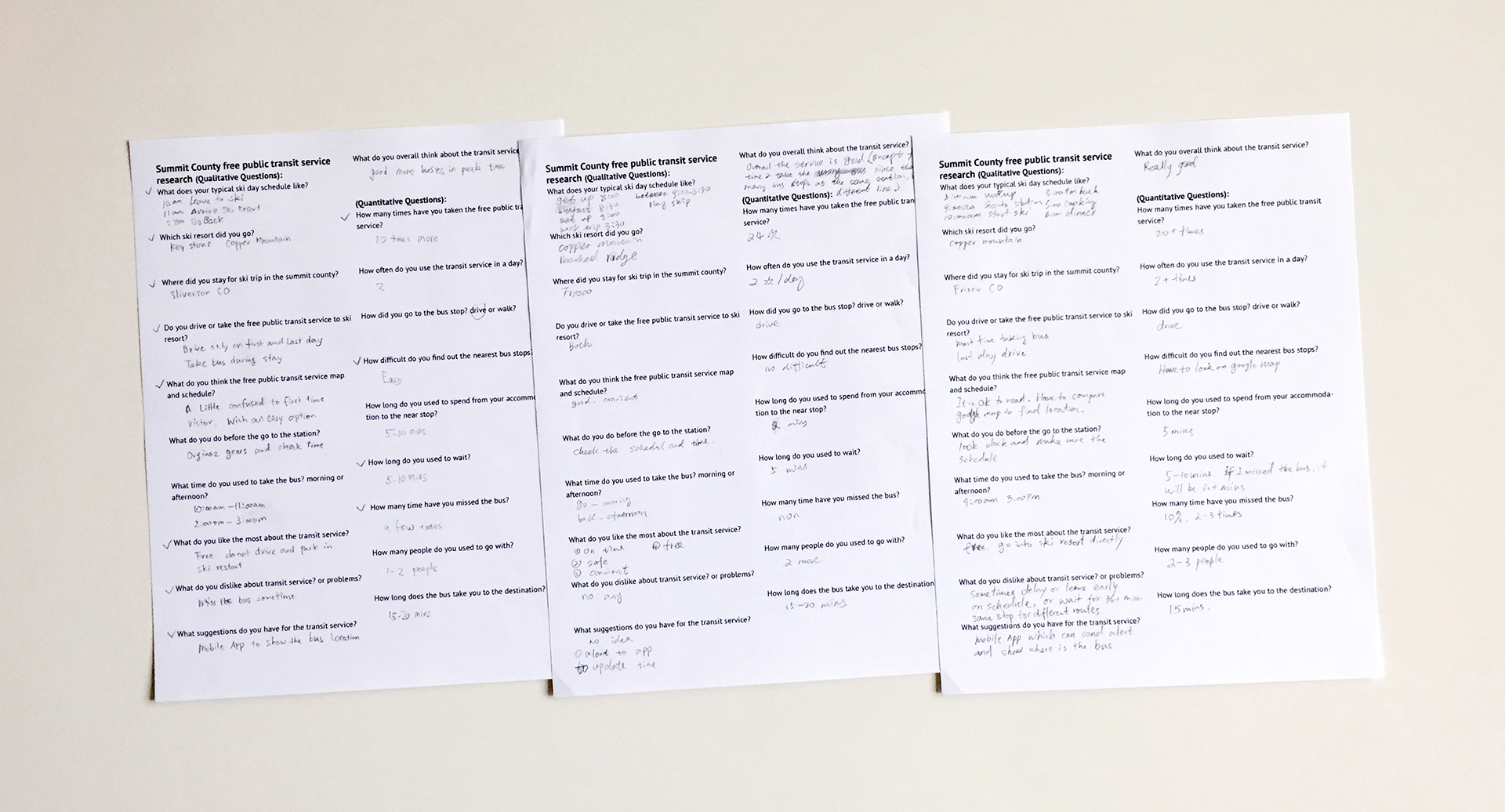
I wrote a questionnaire including a total of 20 qualitative and quantitive questions asking about the experience of using the Summit County free public transit system and called three friends who have used the system and live in Denver CO. They are between 35-50 years old, male and female, single and family. During the conversation, I wrote down their answers to the questionnaires.
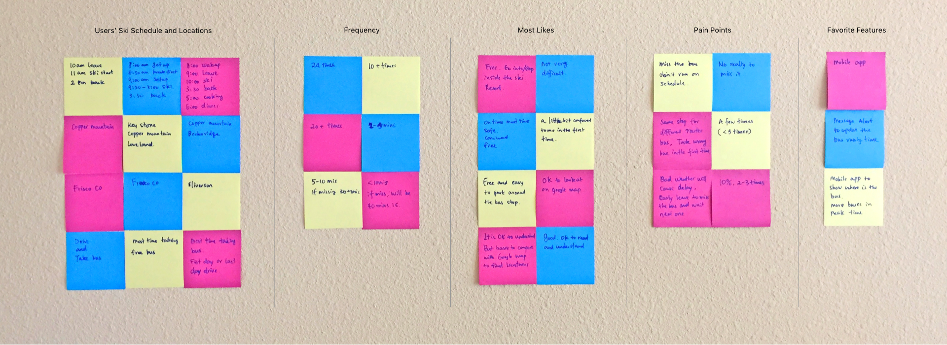
Affinity
map
I wrote down all the answers on sticky notes and grouped them on a wall to make the following affinity map.
Project
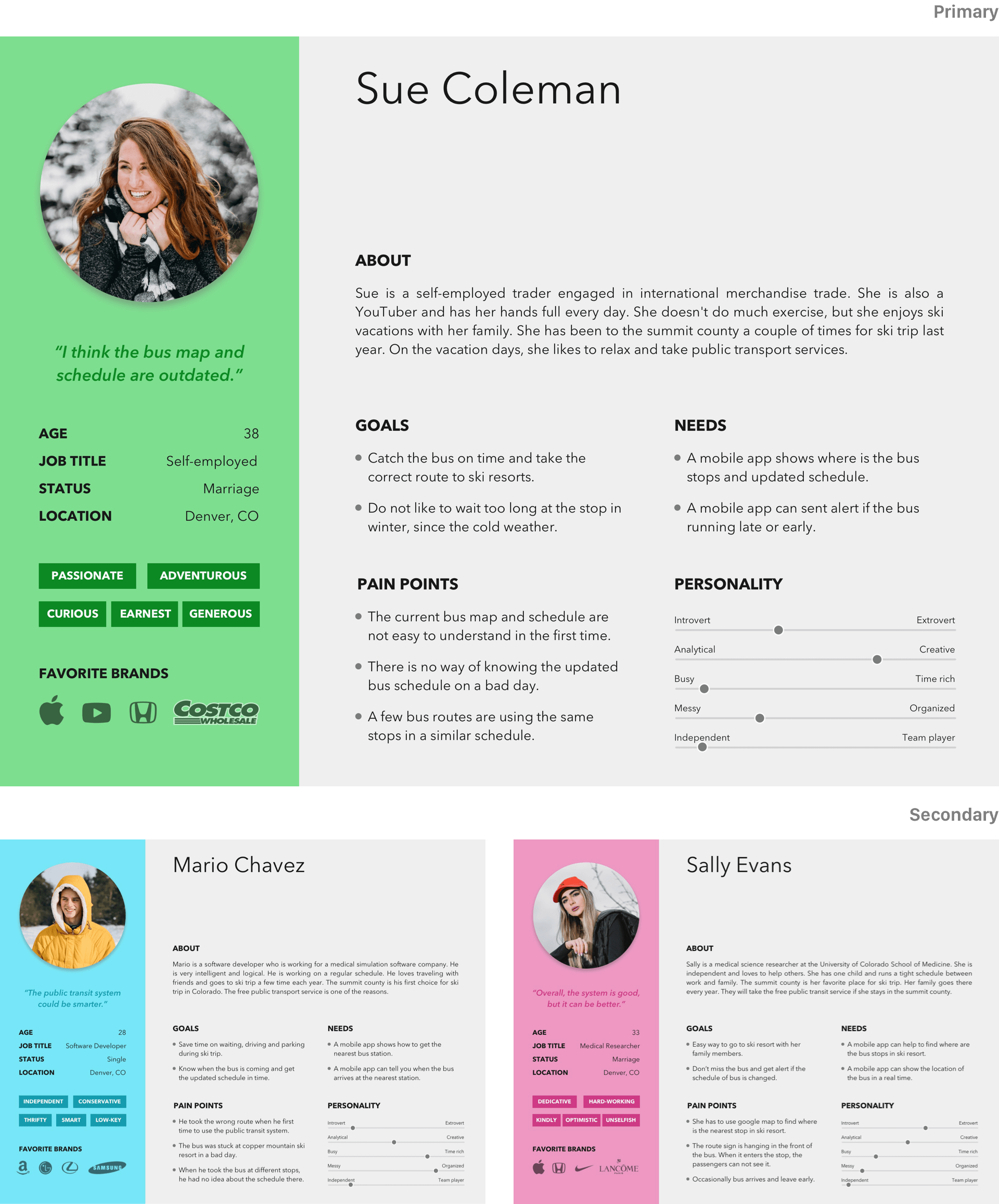
Personas
jounery
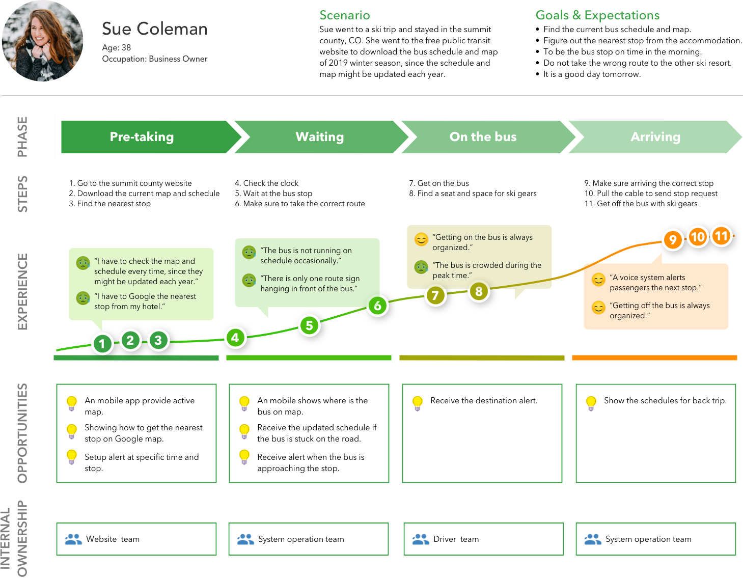
map
Research
Findings
According to the research, I found most people would like to relax when they go on a ski vacation. They don't want to be on the slope with a specific schedule. They would like to go whenever they are ready in the morning. And, they just take the bus from A to B, never exchanging the route to somewhere else. After using the free public transit system a couple of times, they will be familiar with the locations and schedules. So, the most hard time was their first time using the system.
Pain
Points
• Take time to figure out the bus maps and schedules
• Have to google where is the nearest stop
• Have to check the schedules at different stops
• Wait too long if the bus is running late or early
• No way to know the updated schedules on a bad day
• Different routes use the same stops on the same schedule
• Have to google where is the nearest stop
• Have to check the schedules at different stops
• Wait too long if the bus is running late or early
• No way to know the updated schedules on a bad day
• Different routes use the same stops on the same schedule
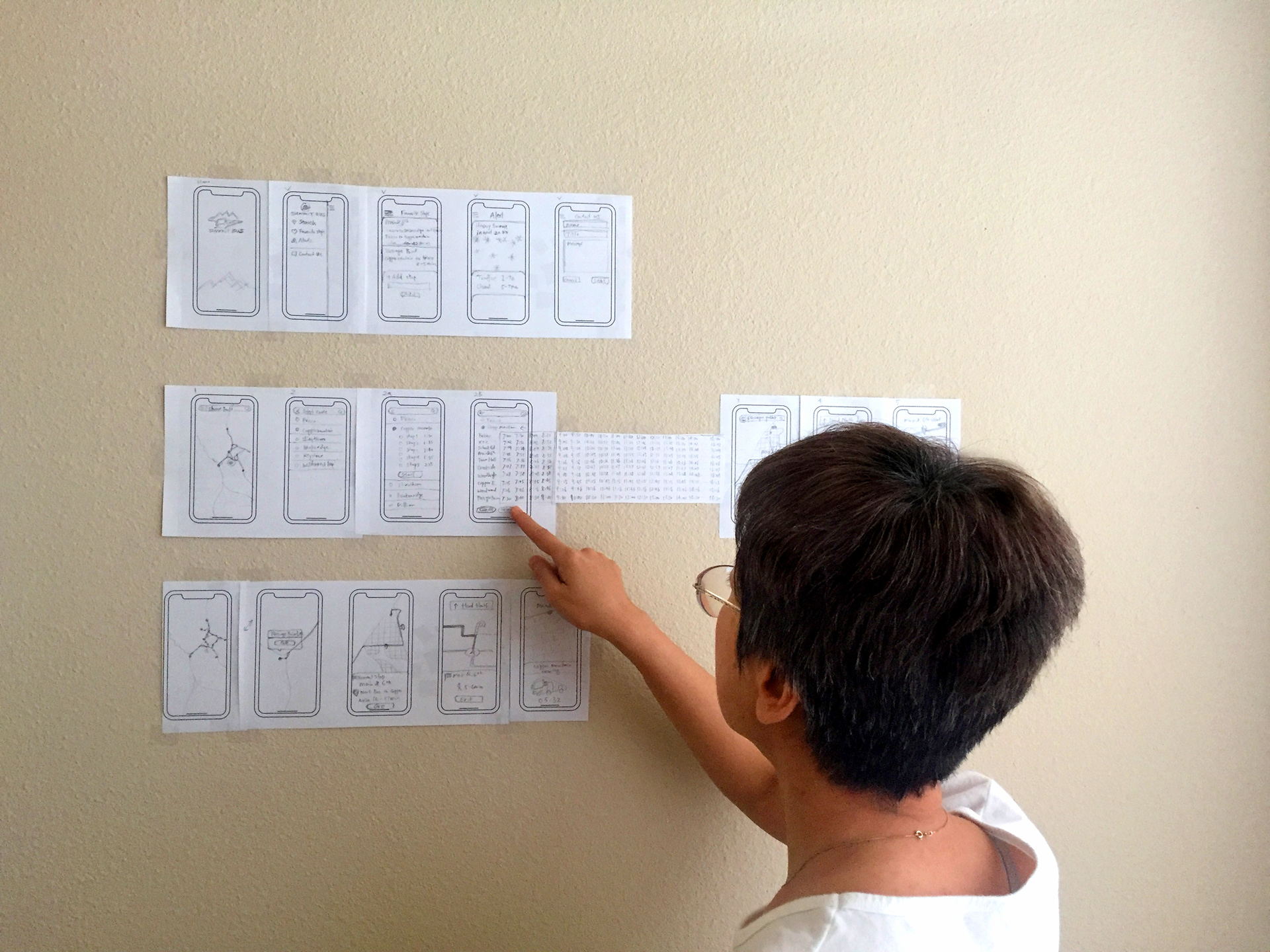
Paper
Prototype
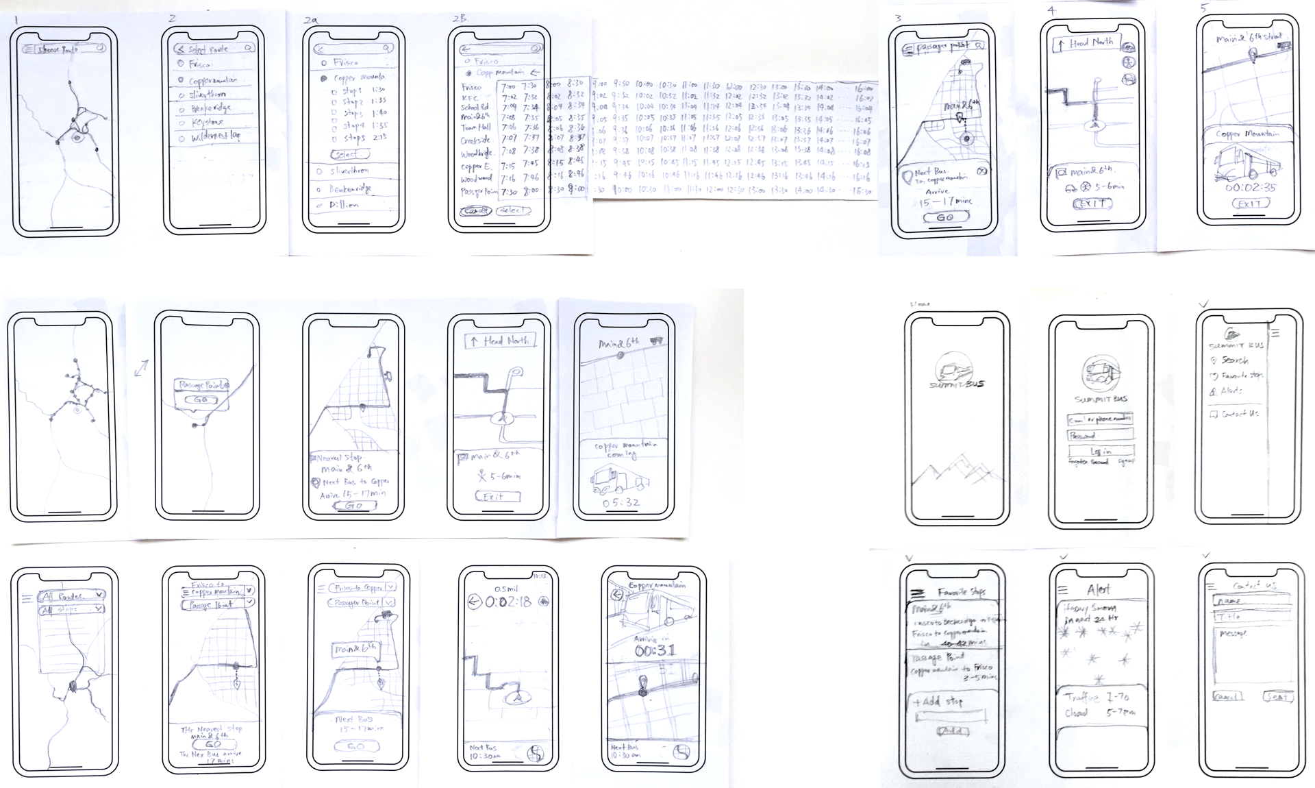
user
testing
I conducted a paper prototype testing with a user to evaluate if my design was effective. The result was a great help to the work.
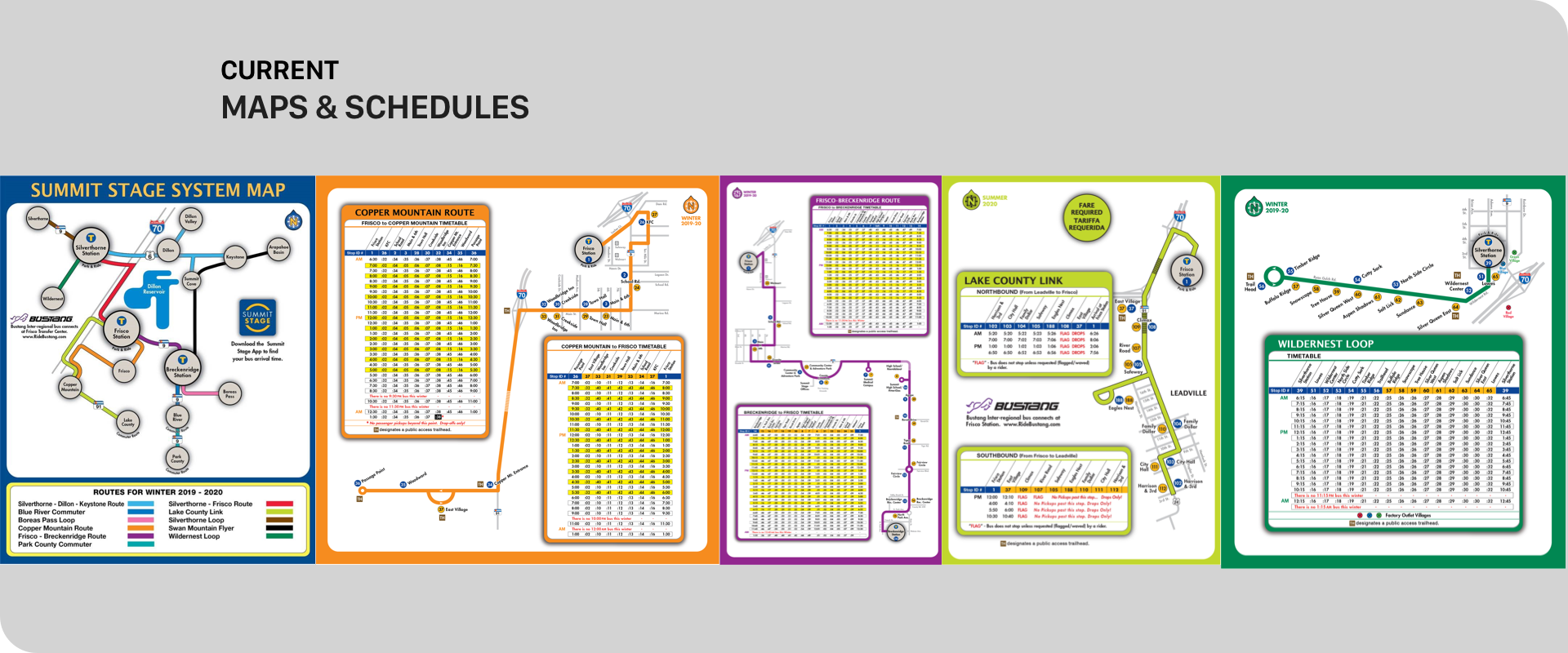
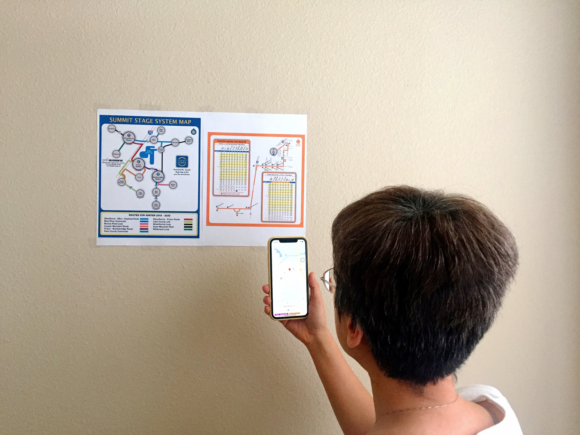
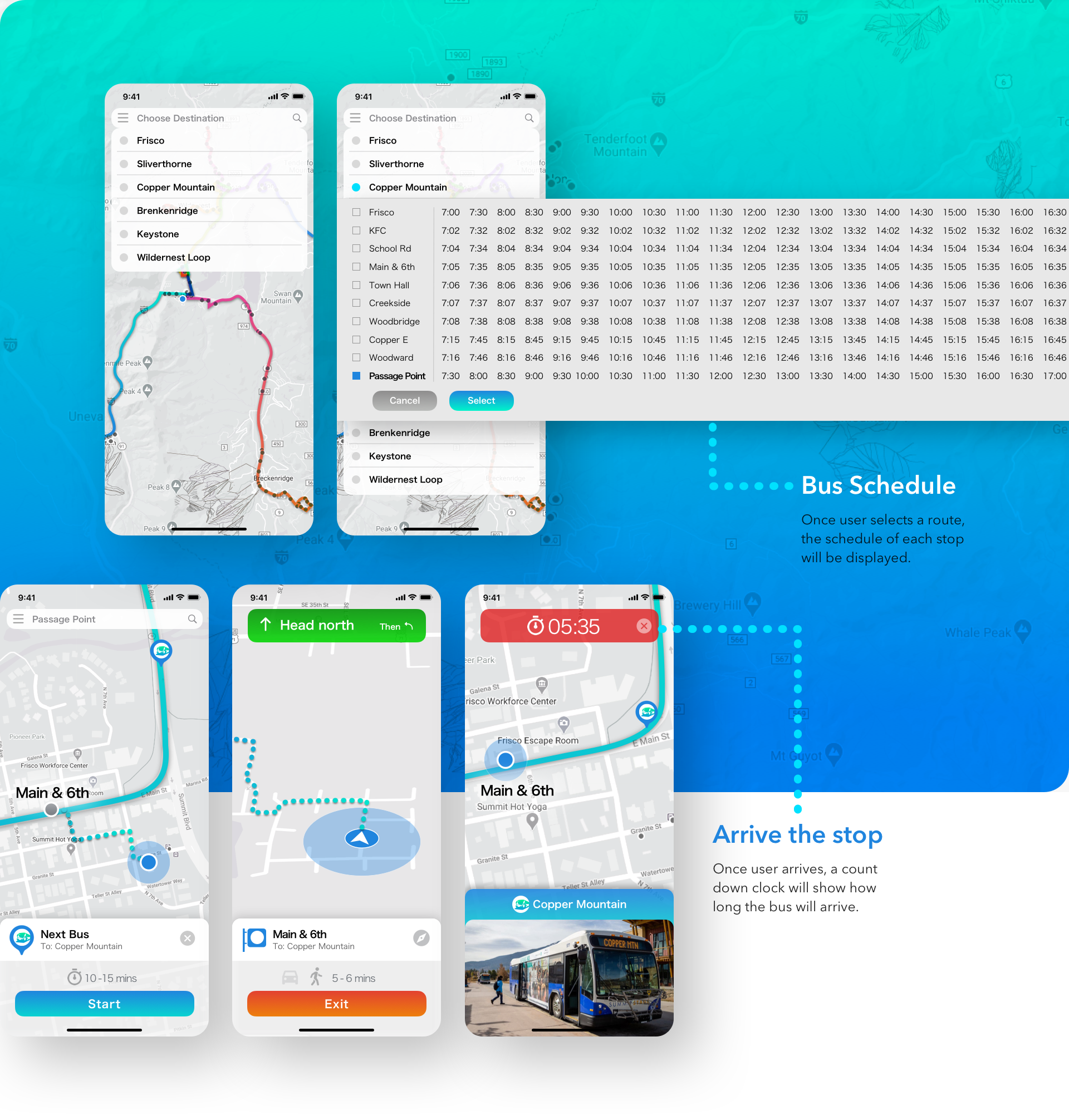
The map & schedule option:
The user spent 8 mins to read the map & schedule. She used Google Map to find out the nearest stop. Then, she checked the Copper Mountain & Frisco timetables to figure out the schedule for the stop. It was a total of 12 mins.
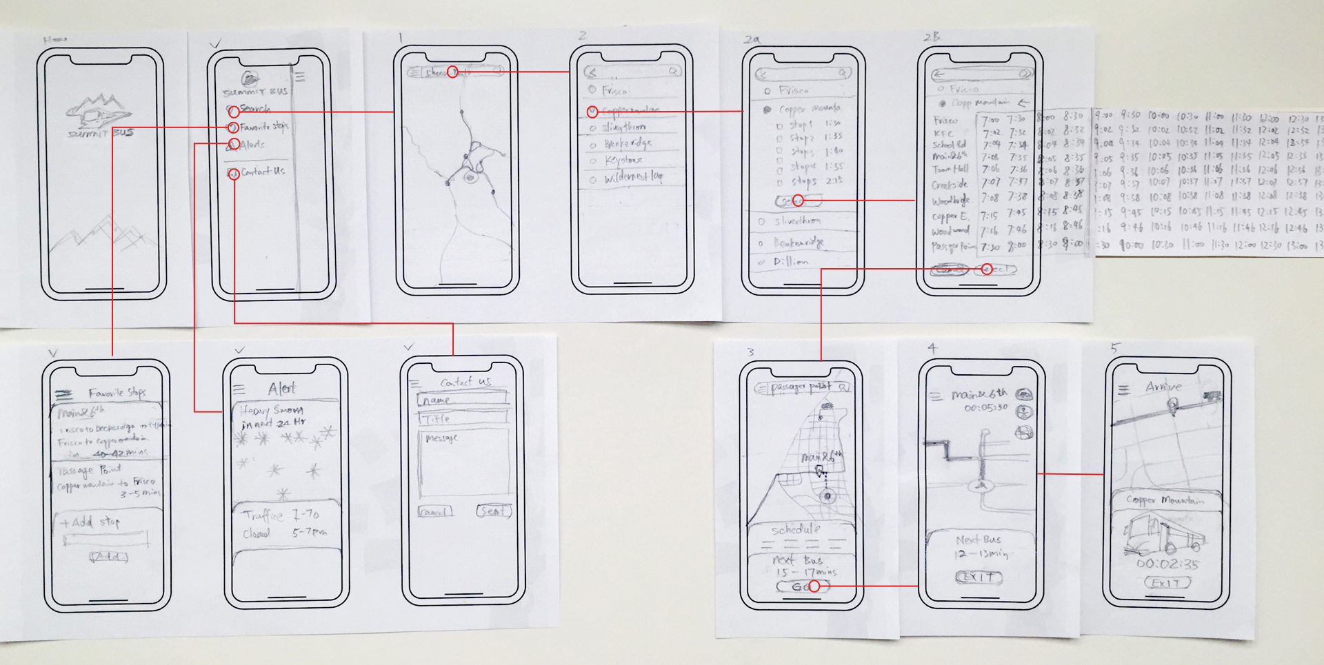
The first prototype:
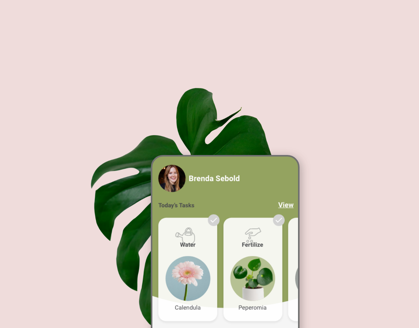
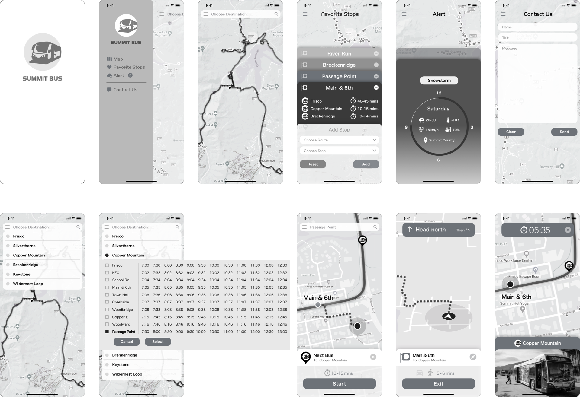
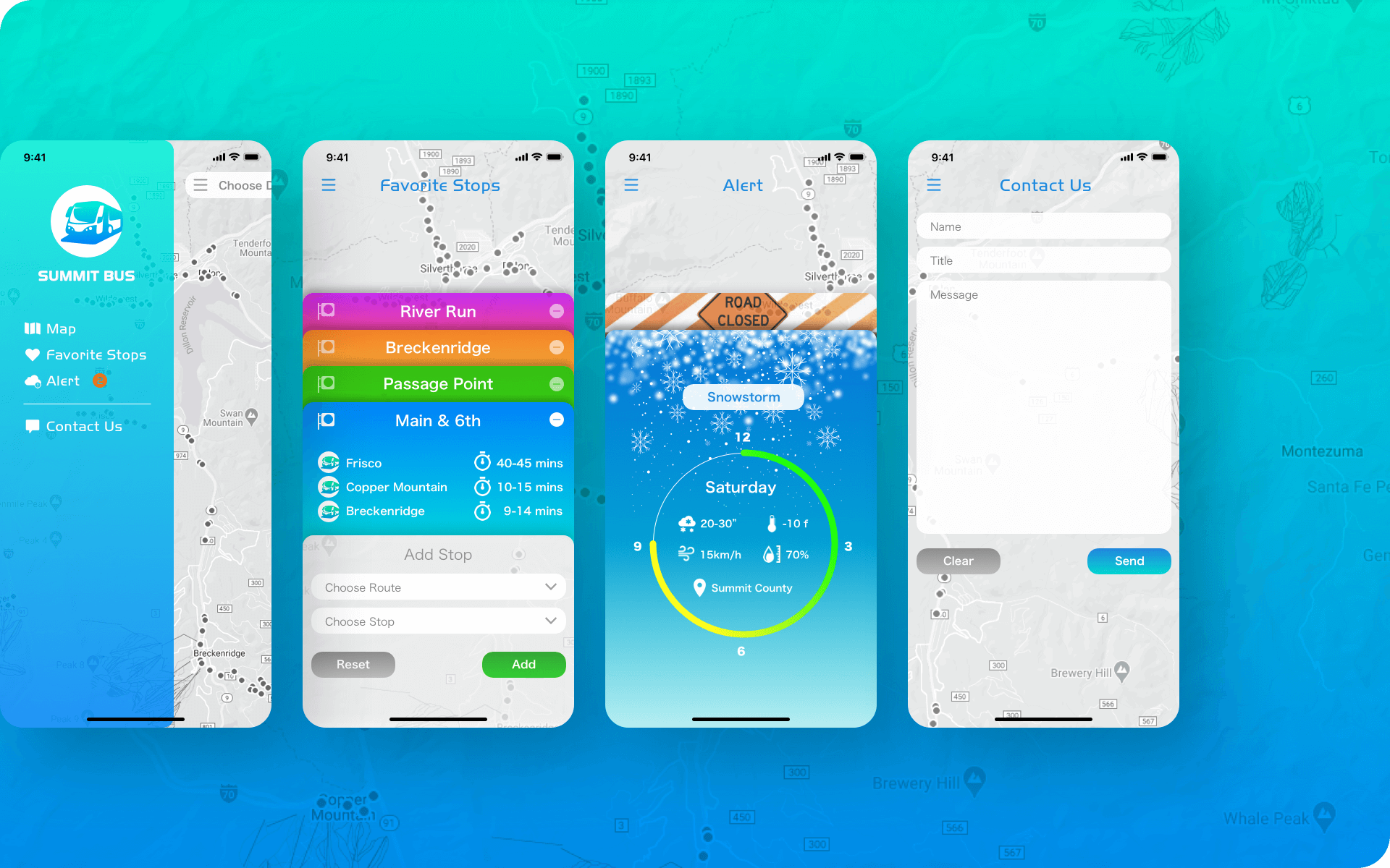
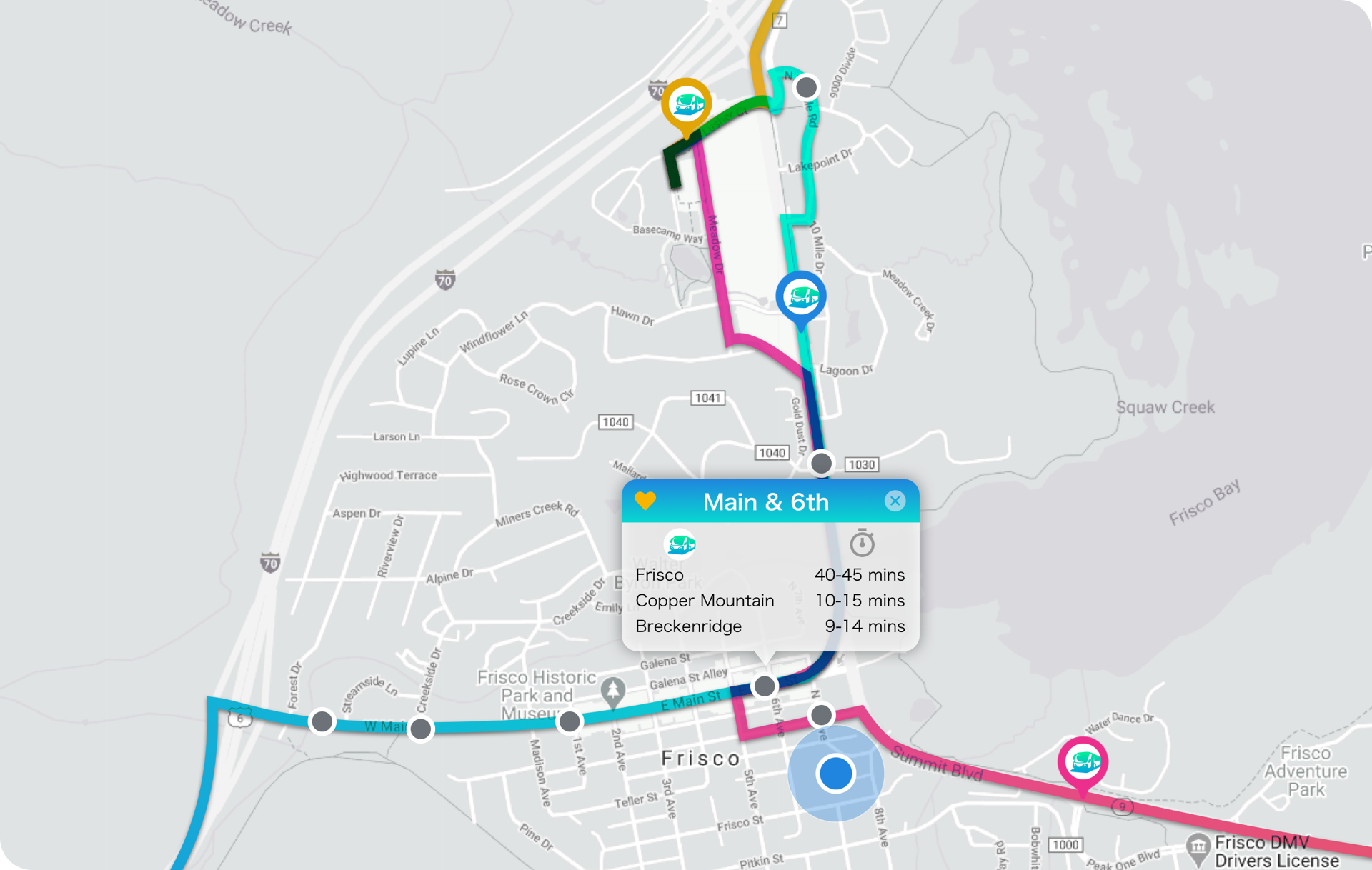
On the home screen, users can select route > destination from a dropdown menu. Then, the app shows the information and schedule of the nearest stop on the map. Once users click “GO”, the app navigates users to the stop with the estimated bus arrival time.
The second prototype:
On the home screen, there is no dropdown menu. User can zoom in/out of the interactive map and find out the destination, then clicks “GO”. The app navigates users to the nearest stop with the estimated bus arrival time.
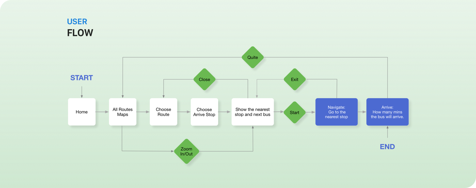
The Result:
The user spent 1’22” to finish the test task on the first prototype option, and 54” on the 2nd option. She felt comfortable with the first one because the dropdown menu was easy to use and the information of the nearest stop was showed up after the destination selected. The problem with the 2nd option was the paper prototype could not perform the functionality of the interactive map. The user could not zoom in/out on the paper map and just jumped to the next step directly.
The result showed that both options worked. The both dropdown menu and interactive map were good features of this product. Finally, the user flow was figured out as below.
LO-fi
Wireframes
Style
GUide
Design
Solution
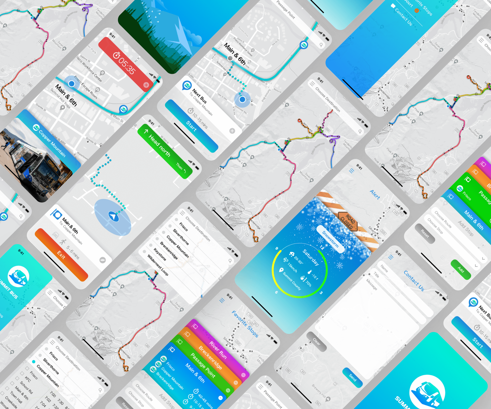
prototype
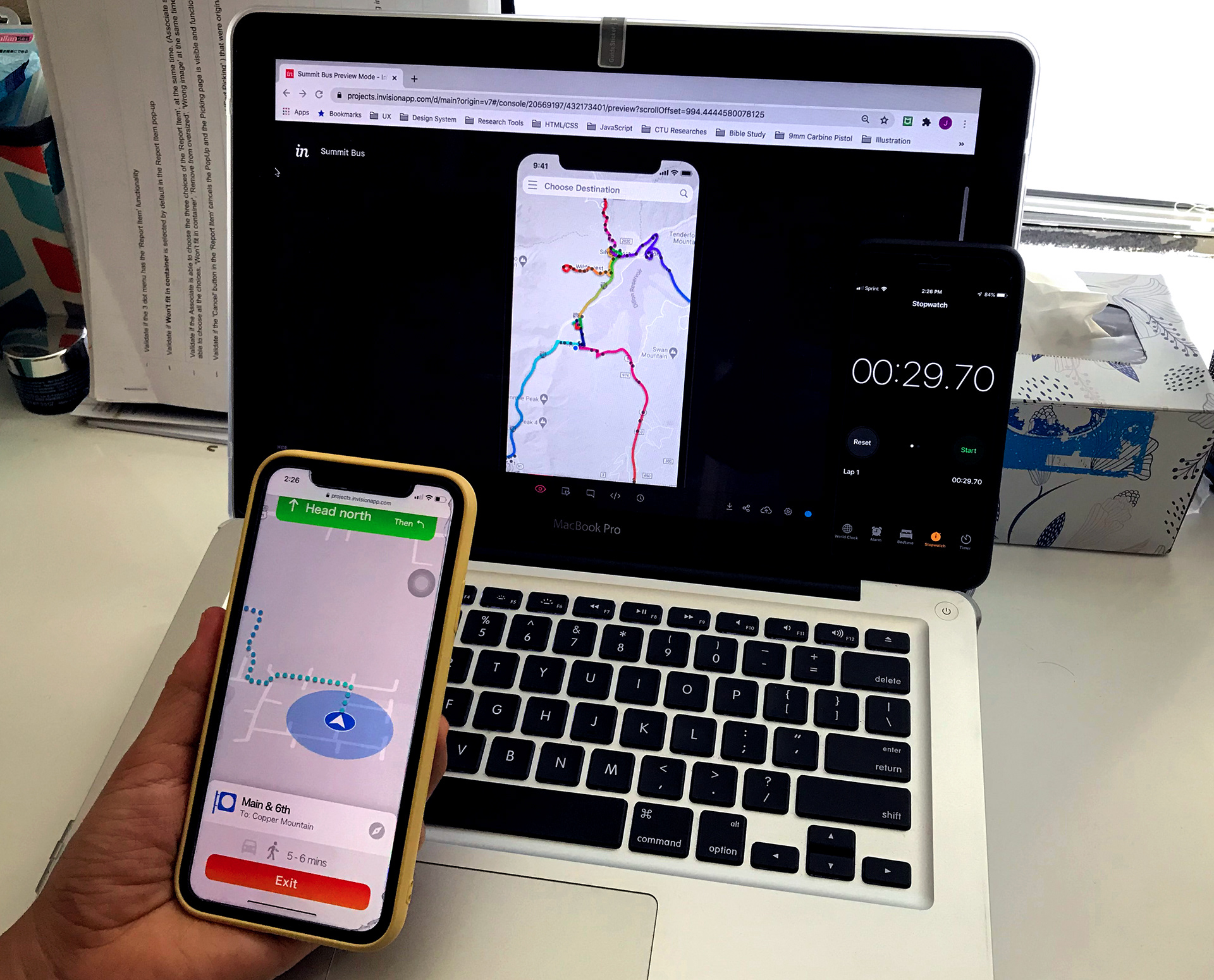
testing
I completed the final design in Sketch and built the hi-fi prototype in InVision. Then, I conducted the hi-fi prototype test. The user tested the prototype on the iPhone 11. She completed the task in 30” which was faster than the previous paper prototype test.
Reflection &
Next step
Through paper prototype testing, I found that the app could save first-time users 91% of the time compared with the original map and schedule option. Meanwhile, I also learned what the user’s most concerned about which gave me a clear direction for the subsequent design work. In the later hi-fi prototype testing, the app saved the user more than 64% of the time compared to the paper prototype test. However, due to the COVID-19 quarantine, I was only able to find one user doing the tests. If more users perform the tests, I think the result would be more accurate and persuasive.
Next step, I plan to find more users to do the hi-fi prototype test and collect their data and feedback. Then, the data and feedback will be evaluated and analyzed for revamping the product in the next iteration.